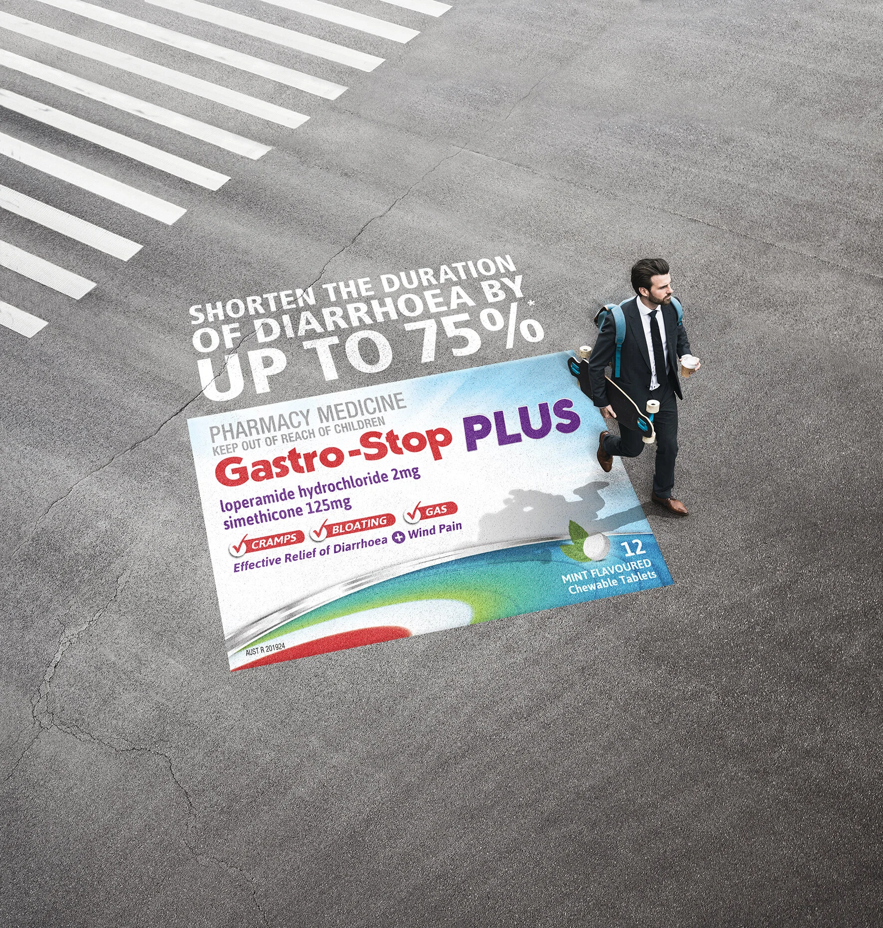
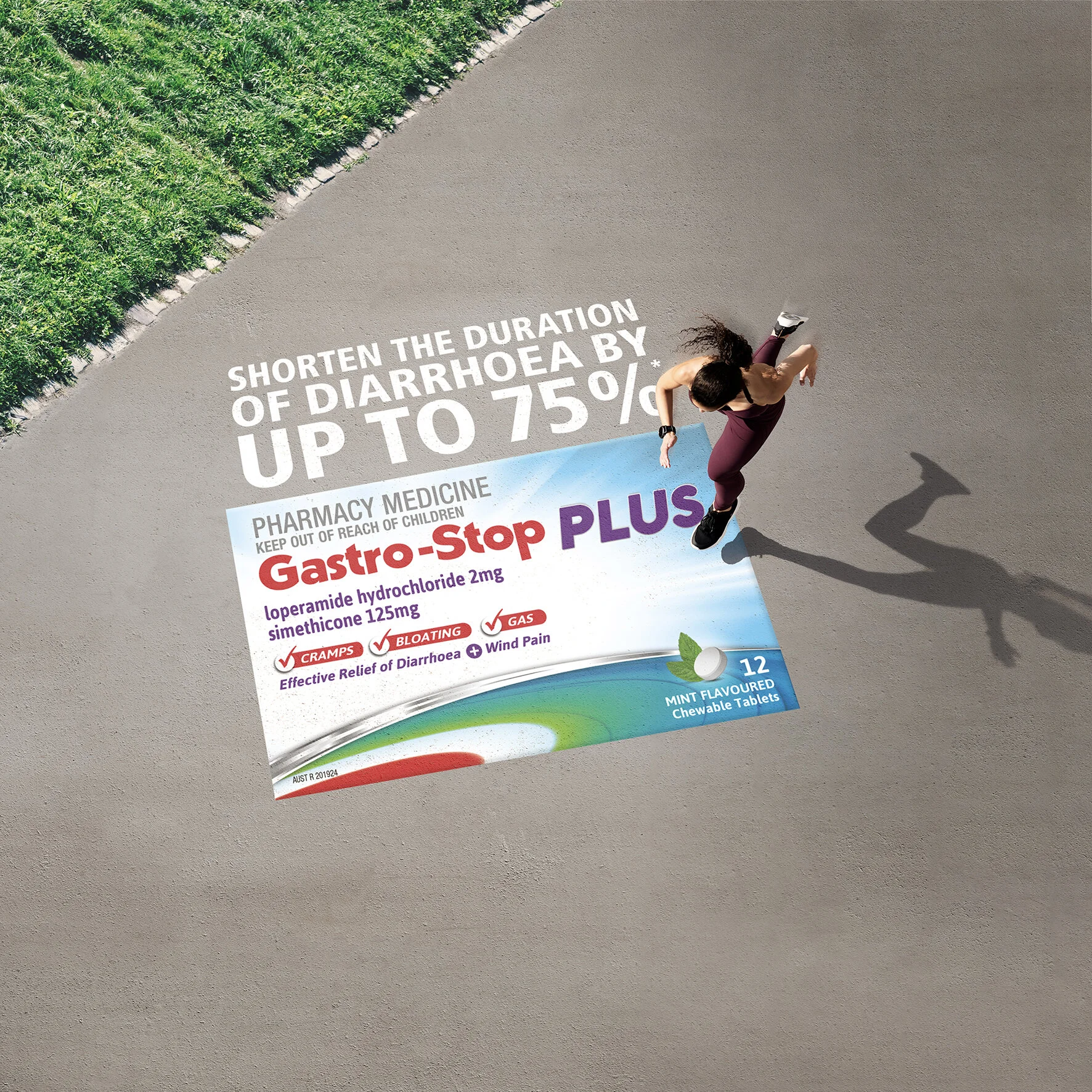
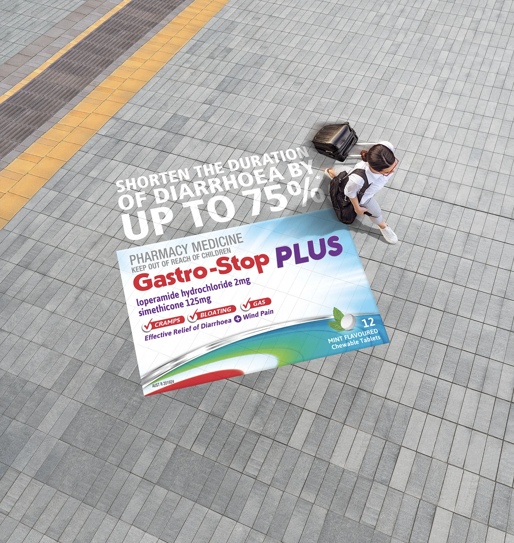
I used library images, both of talent and backgrounds then retouched them together with logo. We stayed fairly graphic with the look. making them more stylized than going for absolute reality as the logo was needing to be very readable; so shadows, patterns and ground textures needed to be very simple and non distracting. The finals ended up being used in lots of places, including the sides of buses.