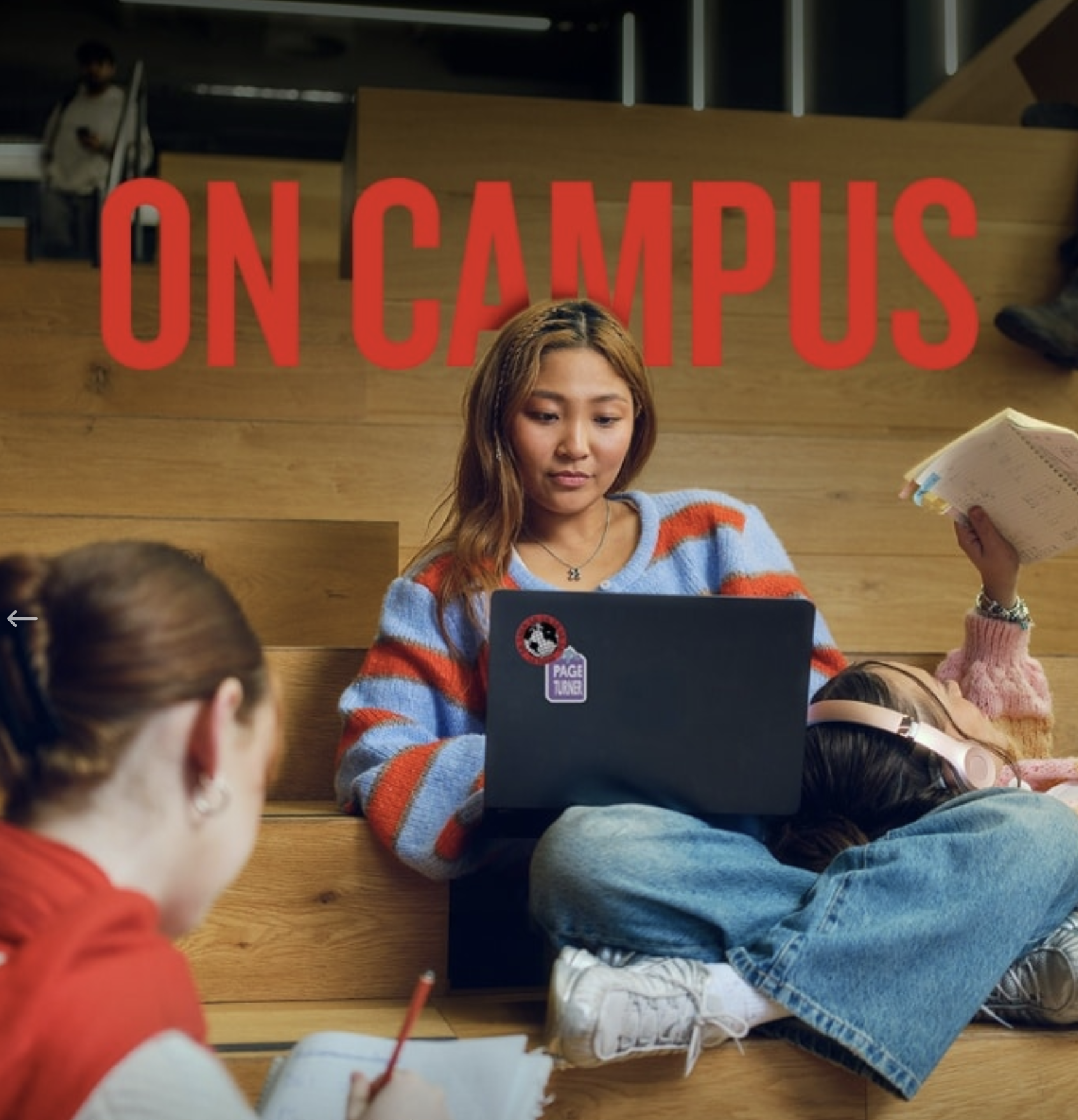
Was great to work on these images with Rex for his latest photo exhibition called Dead Sea Colour, which was exhibited in a Woollahra gallery March/April 2025
Helped create this campaign for SA department of Health. Lots of image combining and enhancement required as well as some big background extensions.
Created this ad for the re-release of Santory’s BOSS MOCHA drink. Made the chocolate and ICED type in retouching, added all new graphics to existing can, then enhanced with the BOSS mist and gradated background.
We took the shots of the talent from the live action TV ads and made the print campaign. We also used the clients cube logo shape to make square particles containing bits of the person, which are in the process of forming the whole human; making them look well and happy.
I combined multiple images to make this ad. I used photo library stock for the wave and a 3D cow from the TVC. However the resolution was quite low for the cow so a lot of detail was added and enhancing was needed to get the cow to work.
Combined the elements to create several formats for this Uni and sports pathway program - It included adding mud and sweat to the talent, extending background, new sky, adding mist and colour treatment.
Combined, enhanced, extended and added colour treatments to these images, which all helped to convey a sense of bullying and intimidation; supporting the message - Respectful Behavior Please.
Created lots of hero images for HomeStart, Adelaide.
Combine extensively to create these OOH ads for Doritos
Combined and enhanced on-site talent with locations and extended all backgrounds to create multiple final images.
Lots of work on enhancing, combining and embedding a 3D Illustration with shot talent.
Bright and enthusiastic was the brief - enjoyed enhancing these images which involved combining elements and adding colour treatments.
Lots of work combining and enhancing to help create this campaign for the new upgraded rail/train services here in Sydney
Created these different campaigns for the Sydney Opera House. I've done lots but only selected a few to show here. Lots of combining of talent with backgrounds and enhancing required.
Helped create these images for Tasmanian Water. Lots of combining and manipulation to achieve these finals.
I helped create these images for Flinders University. There were quite a few variations, using different talent and changed background scene/angle of main building. Lots of combining and manipulation to achieve these finals.
I created these ads for Ogilvy Mumbai and Heckler TV. The agency shot and added the talent separately.
In addition to the larger Key Visuals (with talent) we made 16 other ads of just product with creams, bubbles, lotions and light effects.
Retouched these images for Rasic & Partners. Clean up and colour treatment was all that was needed. Great shots from Michael Corridore
Helped create these images for the latest Fantastic, San Remo campaign out of Adelaide. Loads of work went into this simple but fun idea.
Recently had the pleasure of retouching these images for Winnings Appliances. Lots of outdoor applications/media on this one. Two separate campaigns, one for the stores and one for the Online business.
Did this campaign for a Sydney agency, for the treatment of the disease Psoriasis. Pretty self explanatory what was done. The tricky bit was making the QR code read and yet still feel it was a part of the disease. A compromise had to be made, in the end, so the code ended up needing to be quite clean/clear for it to read.
Retouched and combined multiple images to create this image for the Adelaide 500, 2023.
Retouching was pretty straight forward with this one, a bit of combining, extending and enhancing ;)
A lot of care was taken and client was very clear and instructive. The level of detail and the retouching style has been developed over years of producing quality print for their products. All graphics and many components are left layered in final files so it is graphically and structurally as flexible as it can be, i.e. jugs of milk, glasses of coffee. graphics and lights are all editable if needed, i.e. can be turned off or on.
From Gatsby to Romeo & Juliet, Penn & Teller and SIX. These are just a few of the images I have worked on with the The Opera House. Their jobs can require everything from combining lots of images, changing and enhancing backgrounds, extending images, colour grades to even making animated gifs.
Combine multiple images together for this campaign for SanRemo
Created these packs and backgrounds for the Asian market. All the imagery is CGI.
I loved working on these images. There were 6 finals in total. The retouching included adding new skies, inserting more people into backgrounds, replacing earphones and creating a colour grade.
Created this little bunny and egg in 3D & retouching for Cadbury/Ogilvy. He was designed to match the animated TV character already in existence. He’s being used for a variety of print and online executions.
These images were created recently as a part of an anti gambling ad campaign here in Australia. I worked in conjunction with the TVC’s. The retouching involved manipulating the images to create horizontal and vertical formats of each scene, then adding the water and embedding into scene.
I helped create this hero hot dog for a chain of stores called OTR in the southern states. They sell a “dog” called a Moe.
This campaign was shot using real people. Needless to say lots of cleaning up pimply faces was required, also background extensions (all the horizontal formats needed constructing), some tops needed colour changing and the overall colour grade was enhanced.
I retouched these images for the latest RAMS campaign. I combined the 3D Ram with shot backgrounds of locations and talent, which I retouched and extended for the different crops and varied uses required, as show here with the cross shape on hero image.
I retouched these images for the ongoing campaign called Fearless for Flinders University. My job was to bring out the mood and feel of each shot, as well as clean up (with some modifications) the backgrounds, as well as the talents skin and clothing etc.
Combined elements into this montage for an agency in Adelaide for the 2023 ADL 500 car race.
The brief here was to take the glowing orb of energy, which the agency had already designed, and add it to shots of talent and backgrounds for the new print and online campaign for RED Energy. All backgrounds needed manipulation, extending and grading. The talent were shot (mostly in studio) with some glowing effect in their hands, but much of it was added in post.
Primo get me to create these layouts from scratch using sourced images with some studio food photography. They're for print mainly; sides of buses, OOH, POS etc.
Retouched many images in this OOH and online ad campaign (here are just a few), for a student accommodation company called Scape. The retouch included modifying backgrounds, cleaning up of skin and outfits, replacing occasional head and the occasional rogue body part, replacing skies in some cases and of course, overall color grade.
I created this outdoor poster for RED Energy of a neon sign in the Snowy Mountains. First I built the sign in Photoshop then I retouched it into the landscape, which was made from a combination of several shots. We had a version with the light turned off (just the glass structure) for animation purposes, see below. We then took the neon and moved it (virtually) around the state of Victorian and retouched it into many other landscapes.
We took the talent and backgrounds from stock libraries and combined them with the mural illustrations to make these ads. Also placed the talent (adding legs to male) onto the stools (also library) and added paint splats to clothes etc.
I helped create these images (and many more) for CITI Bank, both for online and print. They usually required large extensions with some careful photo-real illustration, i.e. recreating the bits that are missing, E.g. the boat image; which required rebuilding and extending the boat, its rigging, the sky as well as human legs and feet. I usually just create the bits that are required for the multiple crops i.e. I don’t extend in ares that wont be seen; hence the crazy crucifix shapes.
Retouched this 3D image. I enhanced elements generally, added bubbles to interior and exterior of bottle and colour graded.
Loved working on this product for Design United. The brief was exact and a high level of detailed retouching was required. The various stages of brewing were created as layers, as well we made different coloured version of the product too, and made it so it could appear on different coloured backgrounds if needed, see 5th image.
Created these images for the Sydney Opera House and it’s Antidote festival. A festival of ideas, action and change. Using shot images of talent we then combined with the shot backgrounds I then made the clouds and embedded into scene.
I retouched these for Rasic & Partners. Shots were great, they just needed extending, new skies, a bit of a clean-up and colour grade.
Dylan and Brodie Pawson, also known as ‘The Parkour Twins’ demonstrate the benefits of BOSE SoundSport Free Wireless headphones in this outdoor campaign. Photography by Kristian Taylor-Wood.
Created these images from shots taken during the filming of the videos. I combined elements, made the digital clock, added treatment and the light effects.
We created these images for the launch of a new product - The brief was to make an image that was (exceedingly) full of sunshine and morning warmth - The packs are 3D and backgrounds (including the men, forks and balloon baskets) are from photo libraries, with grading effects over the top. The imagery was to align with the TV spot - a man dreaming about the product.
We created these images of the Schweppes logo with bubbles and splashes for the end-frame of a TVC and print. The bubbles and splashes that framed the logo we designed to compliment the logo shape and not dominate it. Then a few seconds of movement was added along with the atmosphere for the TVC.
The challenge was to get the "energy" right as well as create interesting shapes that suggests a clean and refreshing experience. The images were use for print, outdoor, TVC and a 15 sec animation for DOOH.
I created these images for print and animation of a Picnic Bar exploding with caramel and chocolate bits, for a social media campaign for Cadbury. The bar, packaging and the bits were created in 3D with retouching on top.
Retouched these images for Toyota of their RAV4 recently. The backgrounds are created from stock and were a combination of a few pics. The car was embeded with reflections and wheels spun etc. The neon rail was of course created by us too.
I retouched the talent images for the musical RENT, and put them on the background which I made.
I combined and retouched multiple images to help create this campaign for IPN.
I helped create these Eclipse Chewy tins and fruits bits for a Wrigleys POS campaign through The Station Agency. Attached also is the draft design for the display stand, which shows how the images were going to be used.
I created these images for NOFASD, which is a non profit organization who try and prevent/caution the drinking of alcohol before and during pregnancy, to avoid fetal alcohol disorder to babies; the disorder being anything from attention deficit to autism.
I used library images, both of talent and backgrounds then retouched them together with logo. We stayed fairly graphic with the look. making them more stylized than going for absolute reality as the logo was needing to be very readable; so shadows, patterns and ground textures needed to be very simple and non distracting. The finals ended up being used in lots of places, including the sides of buses.
These food images required clean up and enhancement as well as extensions from their vertical format (how they were shot) to new horizontal layouts. So extensive adding/creating missing halves of items was required.
Retouched this image for Gary Heery and the Sydney Art Quartet. It involved comping a few images together and cleaning up the talent and backgorund.
I created the robe and glasses for the little 3D dragon, and embed him in the scene by re-lighting him, adding shadows and colour grading. I also retouched the background and main talent too.
These fine folk were all shot on location and then I enhanced and extended backgrounds and retouched the painted line-work and graphics into the scenes. There are 2 campaigns here, done over a couple of years.
This was simply a typographical illustration job done this summer (2020) for a chain of convenience stores. Its done in 3D with a bit of retouching on top. Designed to work on what ever background the agency/client needed.
Retouched this print, OOH and digital campaign for Showpony out of Adelaide/Melbourne. It involved a lot of combining, manipulating, embedding and re-creating. Backgrounds, in some cases, needed very large extensions and literally roads put there there weren’t any, and of course the cars are added too.
Jon Bader shot these images for Red Rooster and I retouched them. The first image in the campaign was the “Coming soon” shot and the second and third images are the “Reveal” shots.
I retouched these images together, and added colour treatment in line with international guidelines for brand. Some images were shot specifically for the ads, some are from the Hyundai library and others from standard image libraries.
Here are a few logos I designed
A film director called Steve Back
NSW POLO Association - Had to be able to be printed a variety of ways.
A financial services company
The Classic Safari Company. The brief was illustrate the animals with a vintage style, yet make them feel contemporary too.
Built these little guys for a Phama brand and its marketing needs. Built in 3d and Photoshop’d over the top
Created these images for a pharmaceutical agency here in Syd.
Gary Sheppard shot these for the agency Bashful and I was very happy to retouch them.
Multiple images were sourced and combined to achieve this ambient look for a new campaign out of a healthcare agency in Sydney for the Australian market.
I created these ads, following very closely the overseas campaign. I used existing photography and then mimicked the light sparkle trail for a vertical and horizontal outcome.
We created these gif style animations for Woolongong University. The style was obviously to be low tech., so we kept the frame rate down to a minimum and simplified the color palette. They were created for an online promotion for the Universities MBA courses
Not every job is creative. I recently had a job which required adjusting 180 (approx) umbrellas. Job brief was to deepetch and then adjust the colours, designs and textures for the large range of “Sheltas”, to match swatches supplied.
Here are a few images I helped create for the energy company RED. A very definite colour treatment and effects grade was the brief for this campaign, in which there have been 12 final images. The campaign idea was to use real people from the region and for us to give them a "look" to emphasize their uniqueness.
The ‘Reclaim your ID’ campaign creative sees a patient’s face portrayed utilising objects that have special meaning to them.
The goal was to develop three real individual ‘life’ portraits of patients who have achieved normal lives with ID through holistic management. Our objective was to create a collage of possessions, mementos, emblems, motifs that define each person for websites, in-clinic posters, patient booklet and patient videos.
“Break With Convention”
We created these 4 images from shots of talent and food supplied, which after retouching, we combined with the 3D glass scenes that we built.
We were after a graphic and clean look for the images, so when it came to the broken glass effect we steered away from slivers and small pieces and went for crisp sharp angles and a very bright colour palette. All the images needed to be very wide for outdoor and online/banners, so a massive amount of background glass effect was created.
There were lots of cars in this campaign. As the background wasn't yet designed, I just stuck them on a grey grad which the agency could swap out when they needed to. Lots of individual panel retouching done and lots of care taken with the cars lines and gradations/reflections on panels. Photographer Daniel Herrmann-Zoll
We created this image from literally dozens of shots. It was a load of fun, especially deep-etching the 40 dogs for the background.
We had to design and build in 3D, 4 flies for an animation/tvc. Here's what they looked like as still objects before we animated. They each had to have a personality, though be all the same sort of fly, so couldn't deviate too much from the obvious features and colours. The animation is also embedded below.
Created this for BMW and Oglivy Melbourne, and as you can see, it was designed to wrap around the light-rail tram. Lots of image sourcing was required then stitching all together in a very quick time frame.
Here's a very simple animation we did for the web and a print image.
This was a fun one. Simple and bold as you can see. Some attentive masking was required and plenty of clean up and grading.
We were given a very definite style guide to follow on this job, which we did. The job entailed things like; background/foreground extension, colour corrections, masking, blurring, clean up and a bunch of other tweaks.
We were commissioned to create a number of 3D objects for a Star Casino promotion. Bright and a little bit comical was the brief.
We created this for a Toyota ad. Not sure if it ever ran but we liked making it, so here it is. Water drops are always interesting to work with but in this case we had to make the car look like it was crying, so it needed to be an exaggerated drop.
Here we were asked to create an Isometric illustration for a mining company. The levels had to be done individually, so each of the floors could be pulled apart and stand alone.
We retouched these images from frames supplied off the latest Colorbond TVC. The job mostly entailed clean-up, sharpening and grading but in some cases photo-library shots were combined with the originals to help complete the image.
"Every 15 minutes an Australian child is abused."
We were very happy to be invited in on this project, both for obvious social reasons and for the craftwork involved.
Its a combination of 3D and stock photography. We were after a more illustrative effect with the image, not just straight "out of the can" 3D. We achieved this using stock photography and adding it to the 3D elements, then illustrated/retouched the two together. The image has become the key element across a range of medias.
Agency: Joy
Art Director: Scott Zuliani
Creative Director: Steve Back
So the idea was really simple, take images shot by Ian MacPherson and create broken shells of the models sitting, and add smoke. We 3D'd them as sitting people and then broke them down the middle, scattering the bits near by. We also made the backgrounds and enhanced the talent overall.
We created these images in 3D, including the mans bodies, however the females body was photographed. We animated them as well, which you can see in our motion section.
Retouched these images (plus 15 others) for BOSE Headphones through Rasic & Partners. Go Wallabies!
Created these images from stock supplied. Extended them for massive DOOH billboards, enhanced and graded them into good black and whites.
Built this image out of multiple shots of stadiums, grass, Johnathan Thurston, a bus and a dude.
Sometimes we have to visualize small themed spaces for "pop-up" type kiosks for shopping malls or upcoming major events. These are done just as visuals only to get sign off from client as to what could be built. Here are a few we've done.
Make your own Hot Cross buns
A refined reading room
A ladies afternoon tea room
A Sydney Waters drinking bar
A hairdresser and a James Boags tent, just to name a few...
Defence Housing Australia.
We placed these people onto backgrounds and then performed a little surgery to make their faces line up as well as make them look alike then colour adjustment to make it all pretty.
We created these images for an ongoing Newcastle Permanent print, outdoor and online campaign. Sky writing image we used a library image for the plane and the rest we illustrated.
We helped create many images for a summer and winter fashion campaign for major shopping center complexes. It involved clean up, combining elements, creating backgrounds, fixing shadows, retouching skin, hair, fabrics/patterns and helping to establish the look.
We retouched these 5 ads for a new exercise clothing brand called KIT. General clean up to talent and creating one hero background we dropped all talent onto, clothing adjustments, colour treatment and logo positioning onto clothes.
For this job we had to extend the images, change some of the panels of the car, replace dials and screens, change the colours of some elements and add movement blurs to backgrounds.
Created this H&R Block image in 3D for outdoor use. Its called Attraction and has thousands of little accountant Zombies running towards the light of a dollar coin.
We created this great little character from a 2D logo supplied. We rigged him for an animation, which you can see in our motion section.